About
PirateX is an event agency based in Cologne, Germany, that has been creating unique events since 2010. They specialize in a wide range of event formats, including in-person, hybrid, and digital. Their portfolio includes conferences, trade fairs, award shows, company events, and parties.
With a focus on bringing ideas to life, PirateX works closely with clients to design events that meet their goals and connect with their audience. Using modern technology and creative concepts, they make every event an unforgettable experience.
The main challenge with the PirateX website redesign was ensuring the platform effectively communicated the brand’s creative and innovative spirit while also addressing usability issues. The previous website lacked a cohesive design system and struggled with navigation, particularly on mobile devices.
Additionally, the site needed to showcase PirateX’s diverse portfolio of events in a way that was visually engaging while remaining easy to explore for potential clients. Balancing the need for bold, creative visuals with practical functionality was key to delivering a successful redesign.
Challenge
Design Aproach
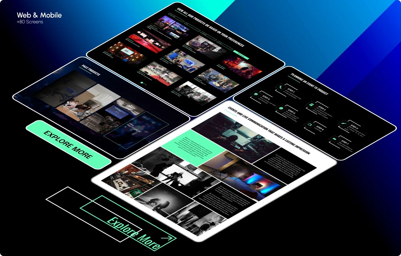
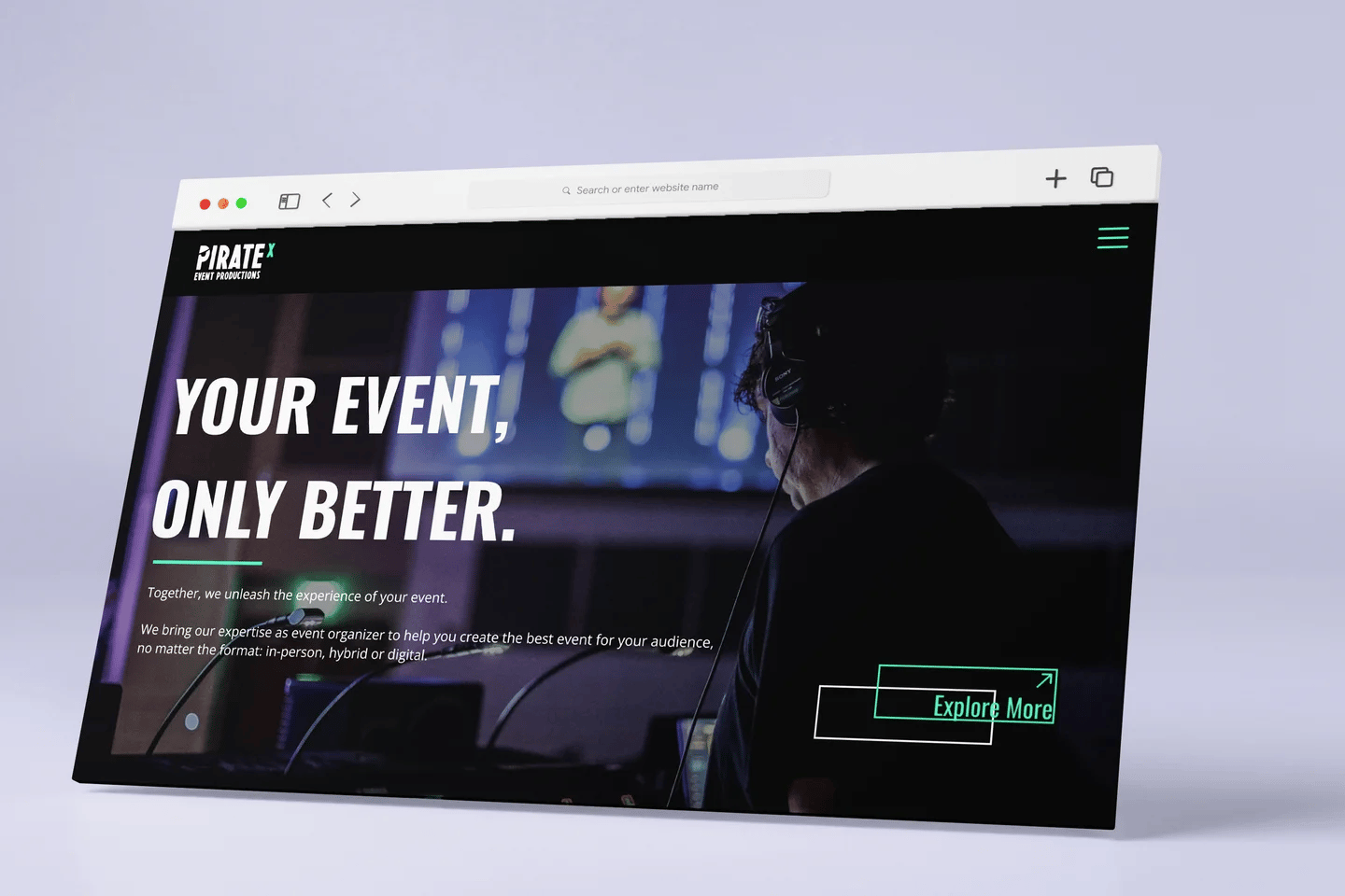
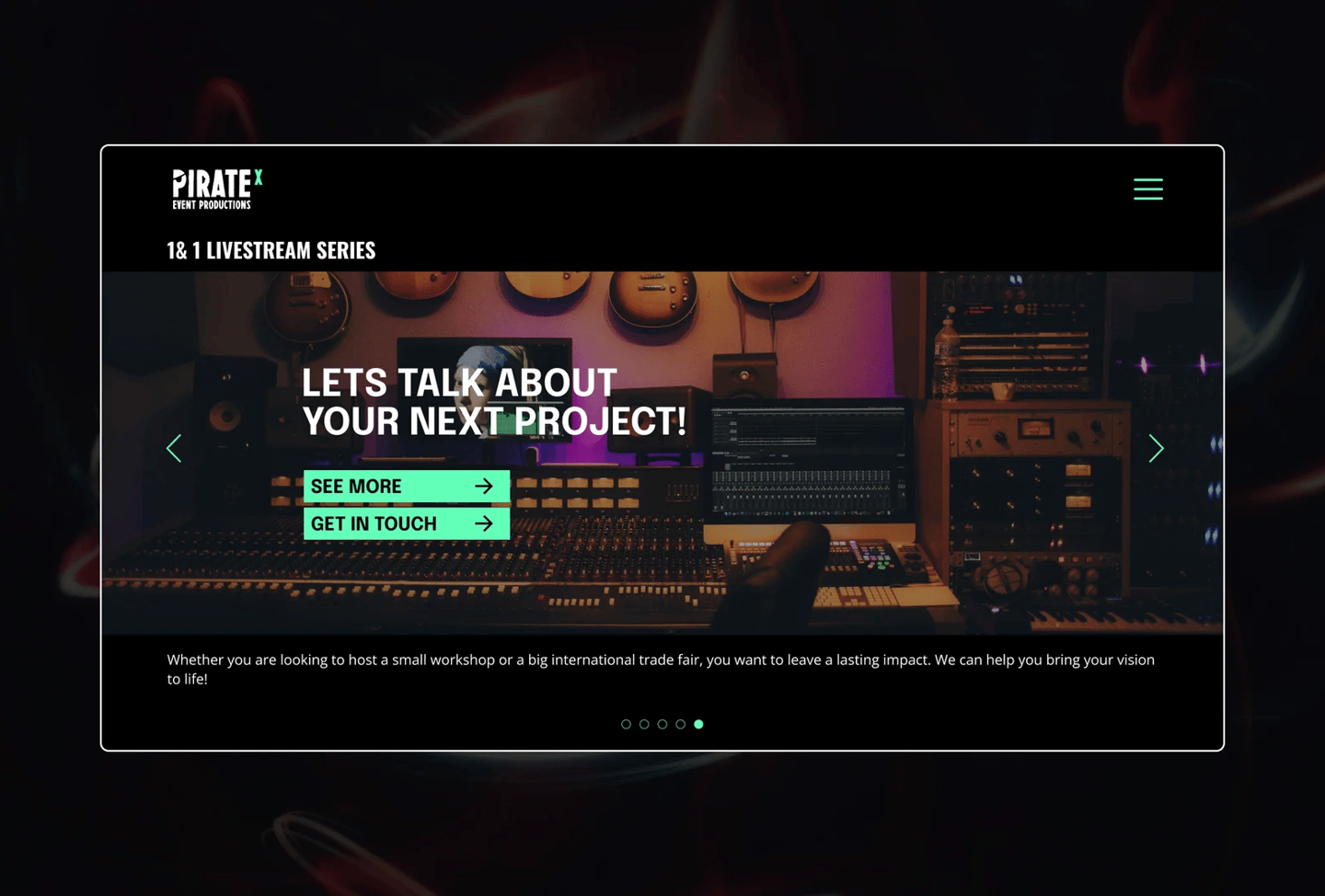
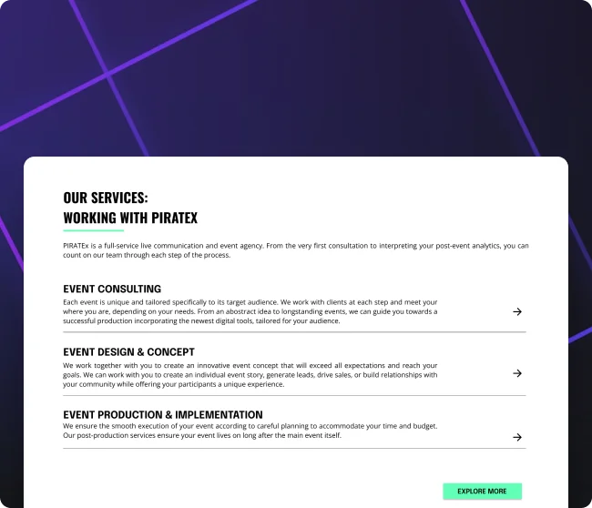
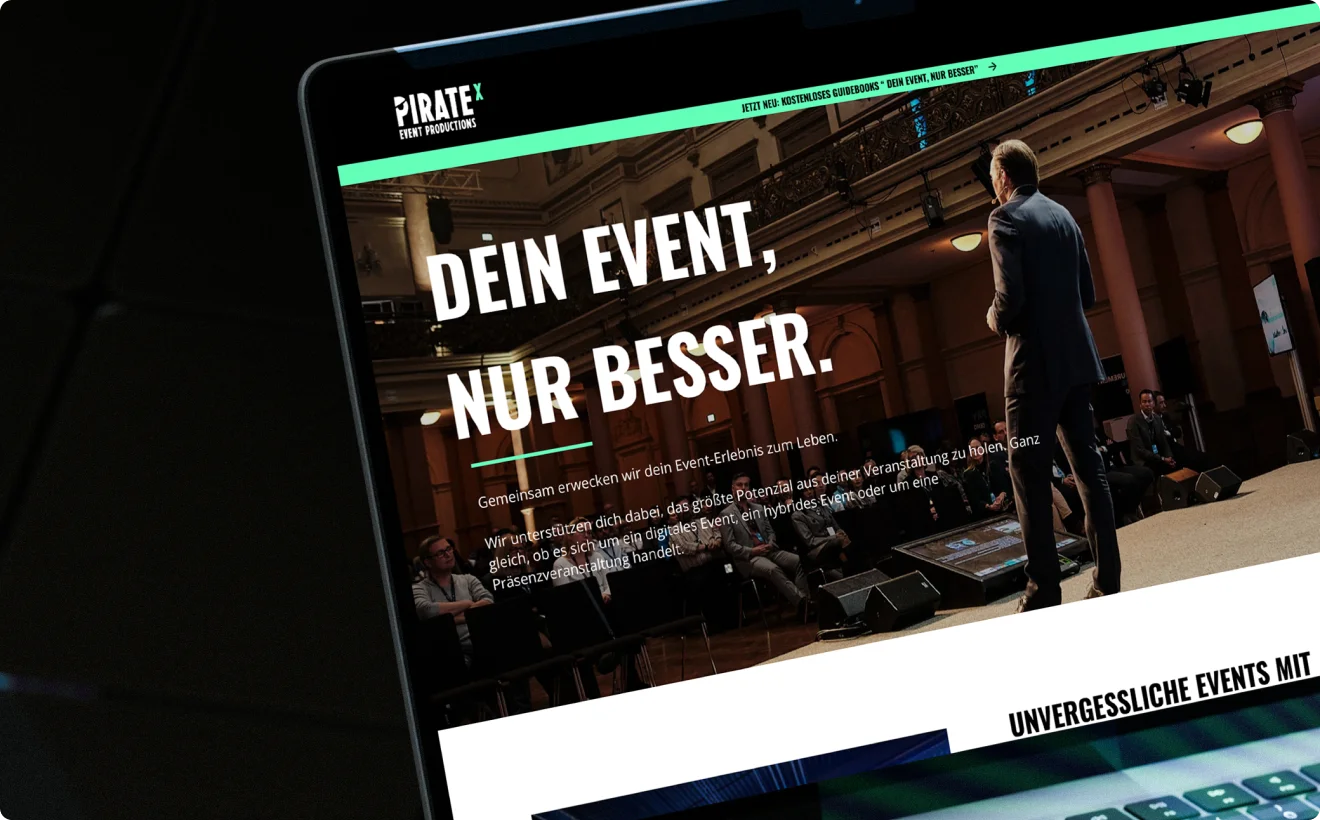
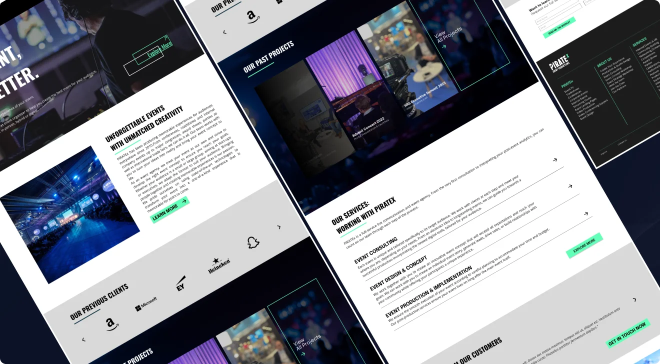
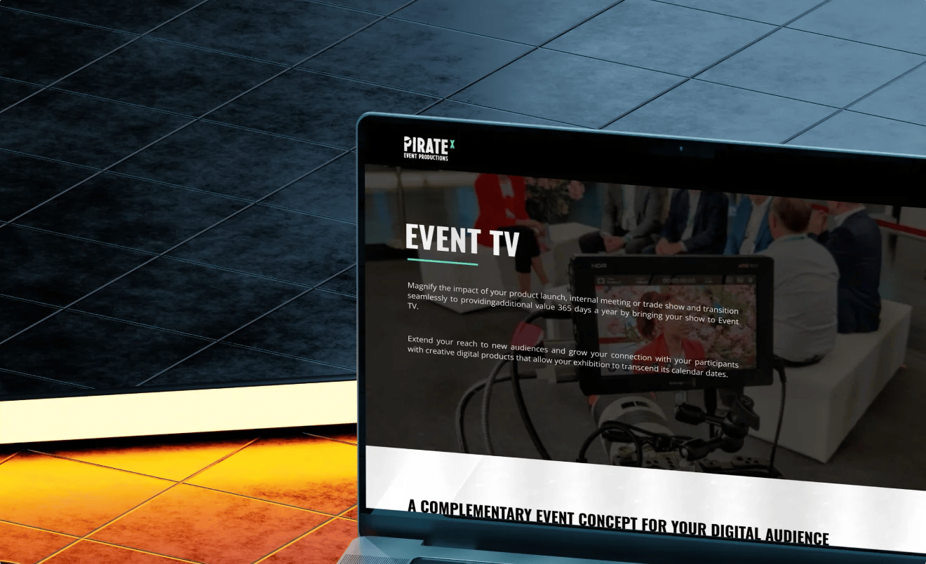
For the PirateX website redesign, my focus was on creating a clean, modern design that would reflect the company’s energy and creativity. I started by simplifying the layout to make the site easier to navigate, ensuring users could quickly find key information about services and events.
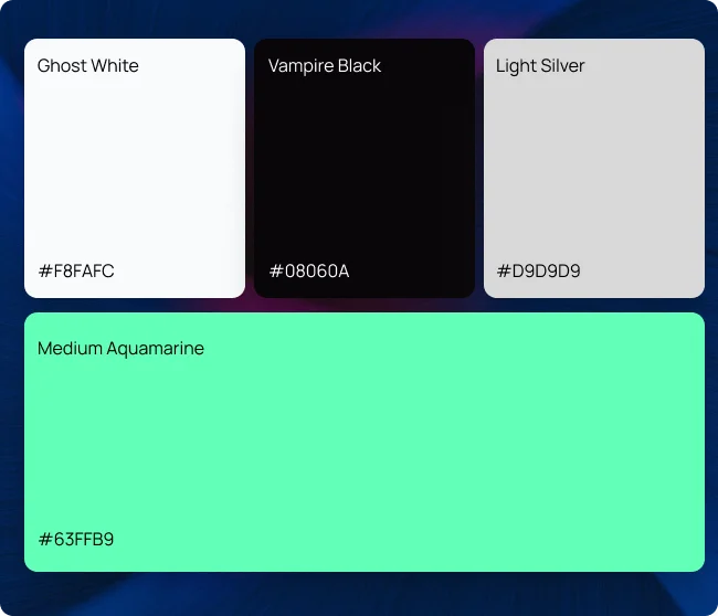
I also worked on establishing a consistent visual style by updating the color palette, typography, and imagery. These changes helped to create a cohesive look across both the web and mobile versions of the site. The mobile design was given special attention to make sure it worked smoothly on all devices, with touch-friendly navigation and layouts optimized for smaller screens.
Overall, the goal was to deliver a design that was simple, user-friendly, and aligned with PirateX’s brand identity.
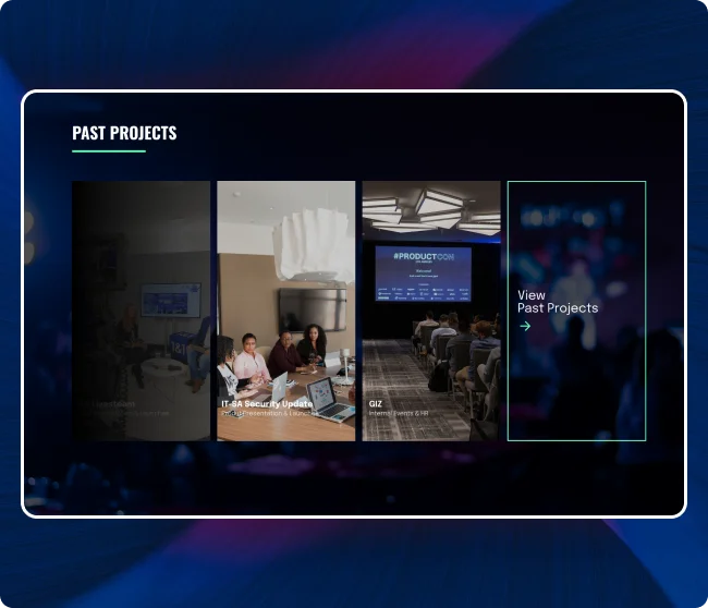
Consistent Visual Language
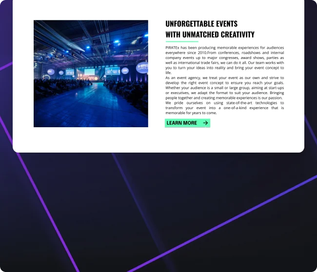
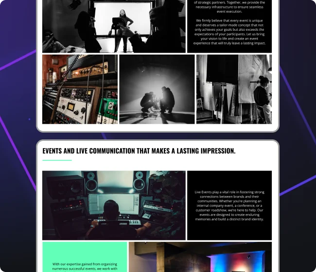
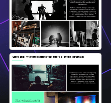
One of my priorities during the redesign was to create a consistent visual style that matched PirateX’s bold and creative personality. I updated the color palette to use brighter, more vibrant tones that reflected the brand’s energy. I also selected modern, easy-to-read fonts to improve the overall readability of the site.
To make the website more engaging, I used high-quality images of events to highlight PirateX’s work and bring their story to life. Every detail, from button styles to spacing, was designed to look polished and professional while maintaining a cohesive feel across both web and mobile platforms
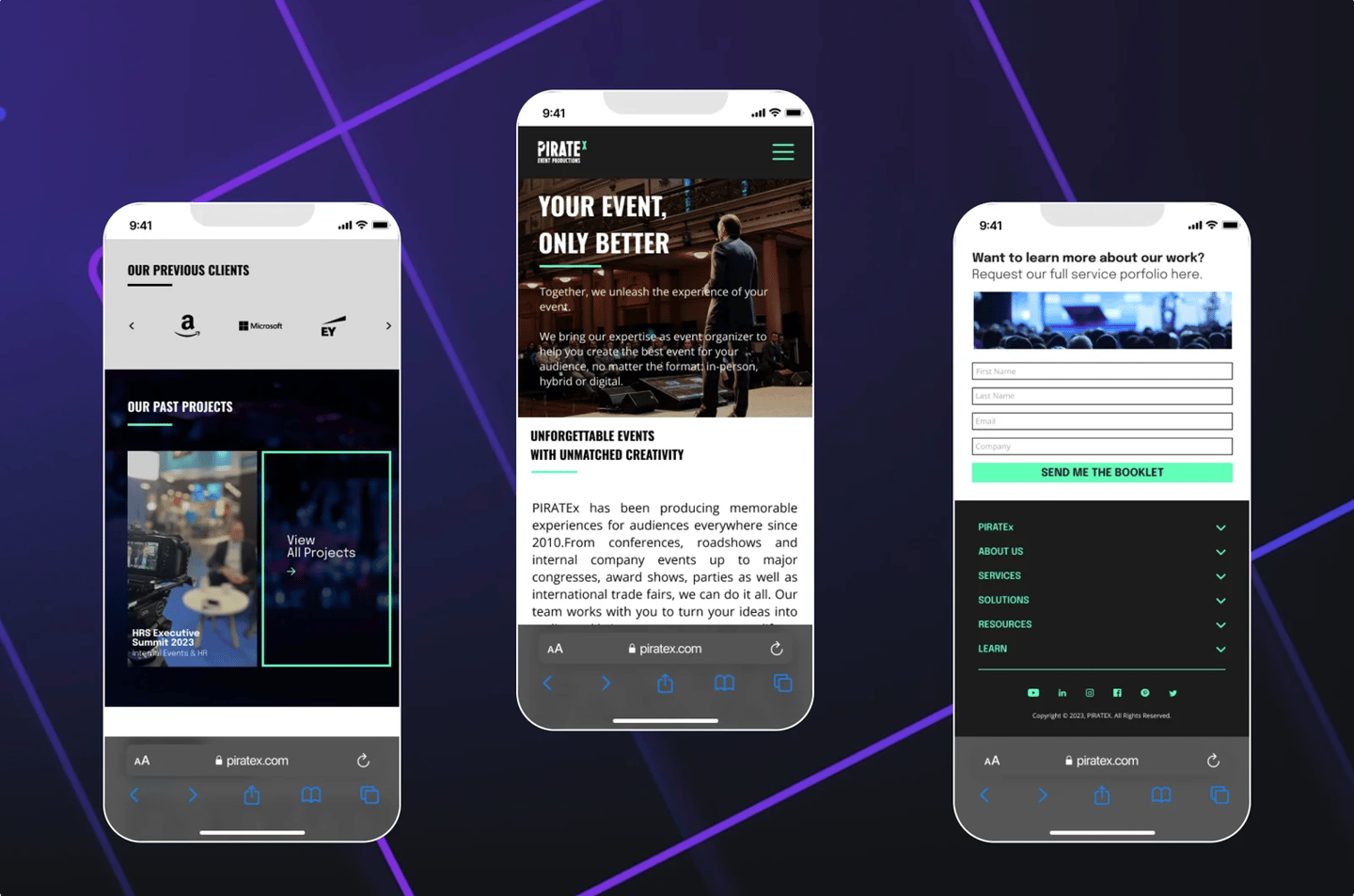
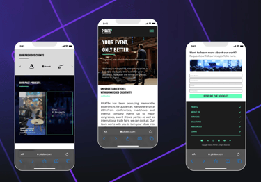
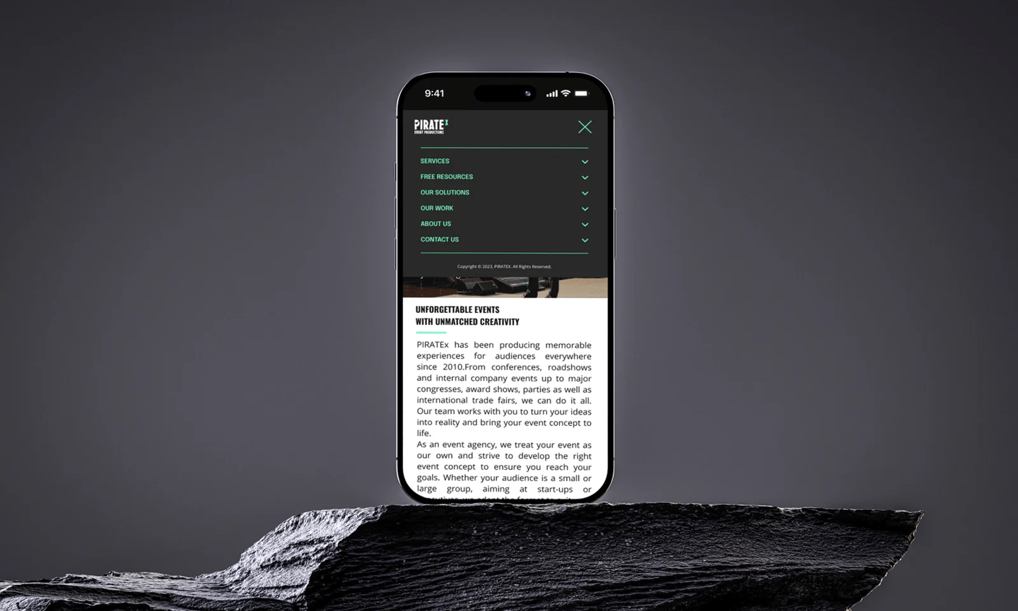
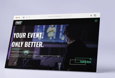
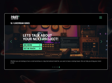
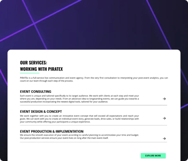
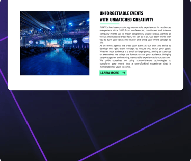
Mobile Experience
The mobile version of the PirateX website was designed to be simple and easy to use. The web design was carefully adapted for mobile, ensuring it remains scalable and works perfectly on smaller screens with clear navigation and touch-friendly elements.