About
CIRCLE is an online banking app that allows users to manage all aspects of their financial lives - from tracking investments to paying bills on the go. With features like mobile check deposit, budgeting tools, and card controls, CIRCLE aims to provide a great digital banking experience for individuals, small businesses, and institutional clients.
Despite its rich feature set, the original CIRCLE app suffered from a non optimal user experience. Users had difficulty navigating between tools, locating key actions like bill payments and transfers, and managing their money efficiently. The challenge was to unify these capabilities into a new intuitive interface without overwhelming the user.
Challenge


Research
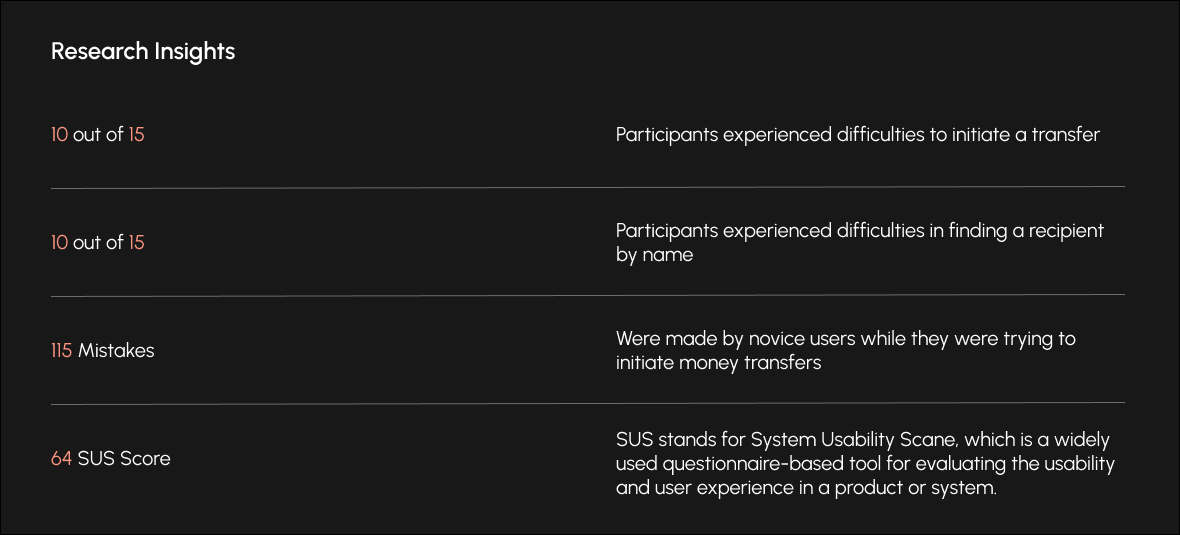
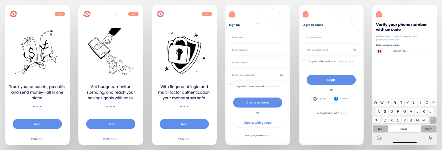
I did moderated usability testing with 15 participants (ages 25–55, mixed financial backgrounds). In the study i focused on the question "how can we evaluate on the efficiency on money transfers on the mobile application of the bank?
Method of evaluation was moderated usability study and SUS questionnaire.
Metrics measured were success rate, number of errors and time on tasks.
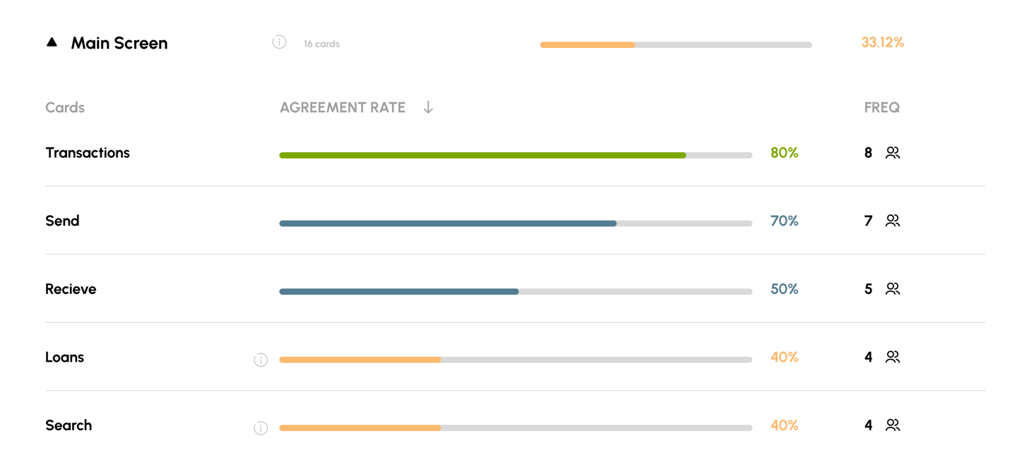
To assess and enhance the app's information architecture, I used the Card Sorting method conducted within the Maze tool. I successfully recruited a group of 15 participants for the testing. The findings indicated that the current information architecture generally aligns with user expectations, though with some recommended additions and prioritizations.
Card Sorting
Results
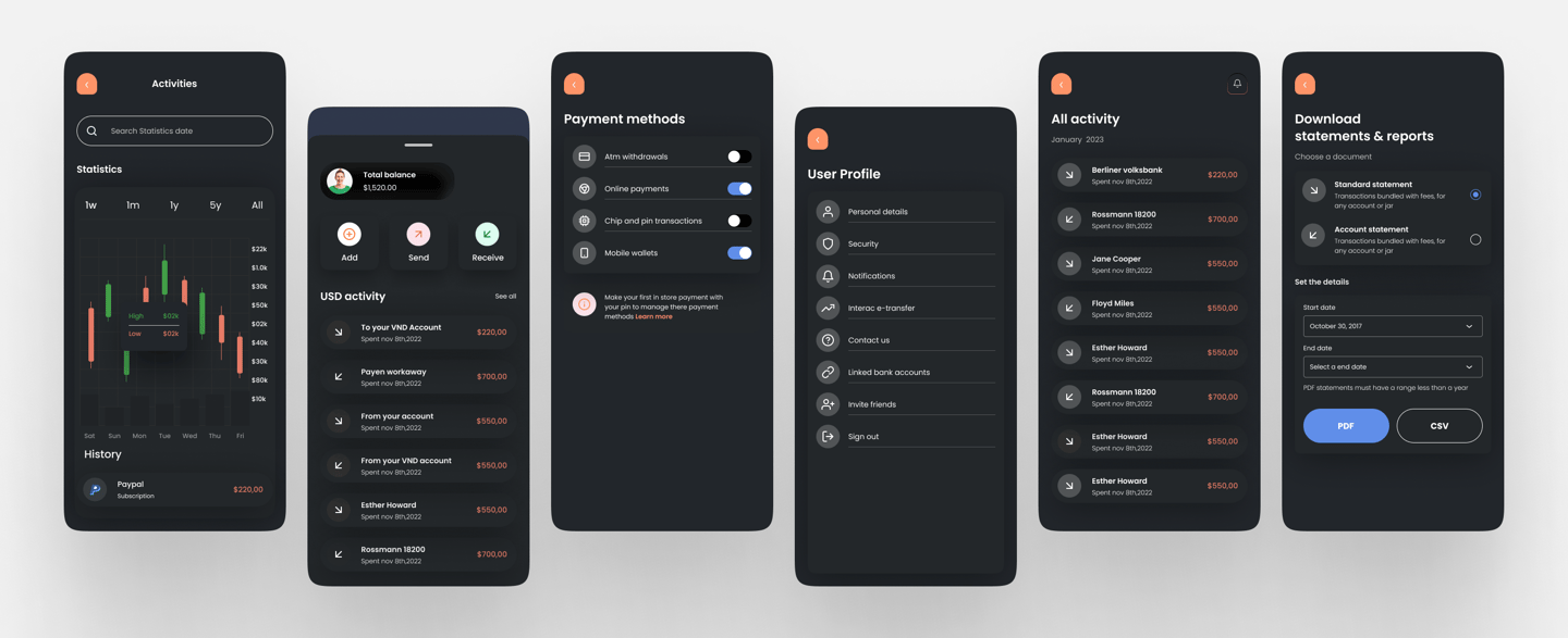
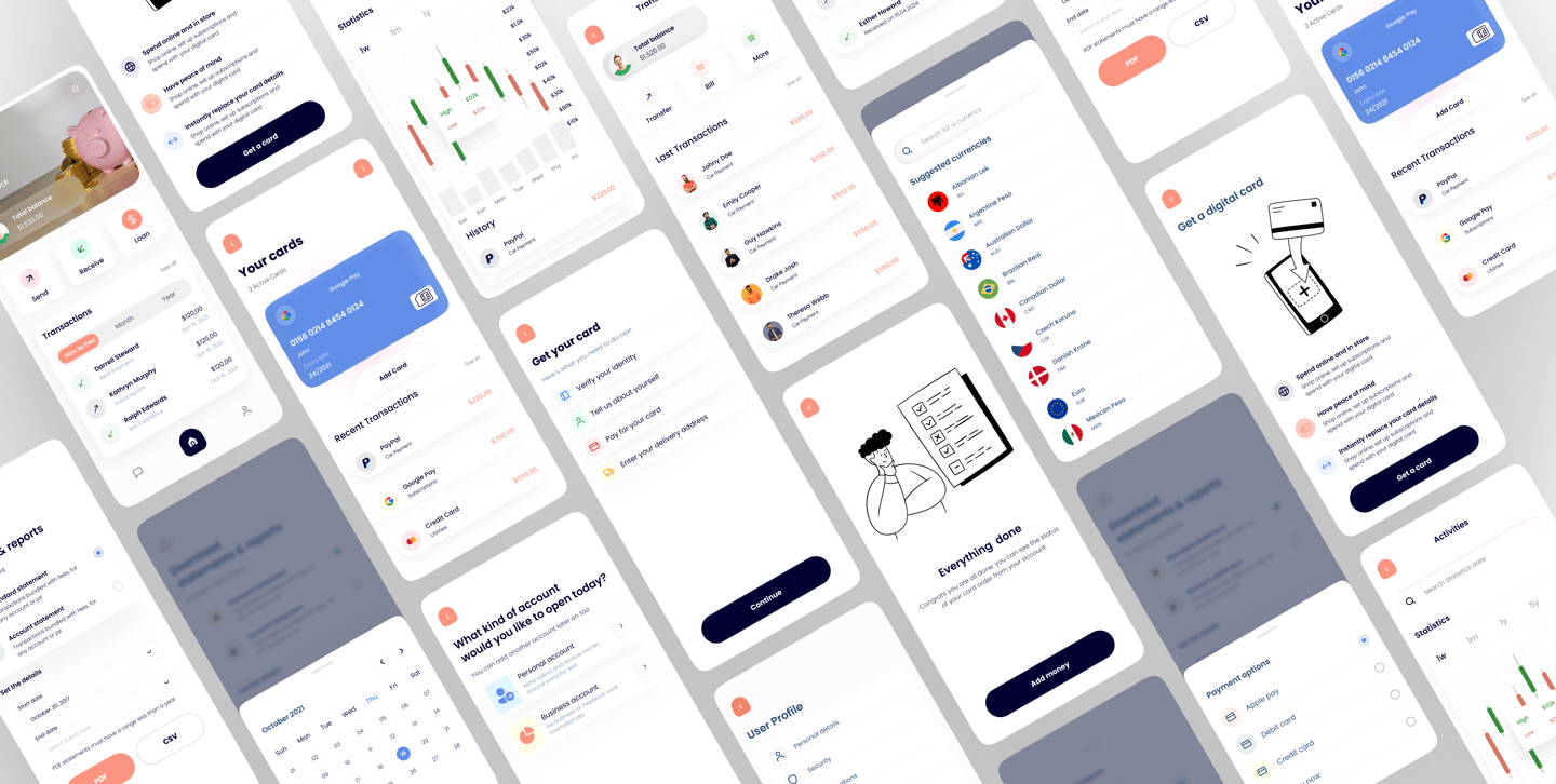
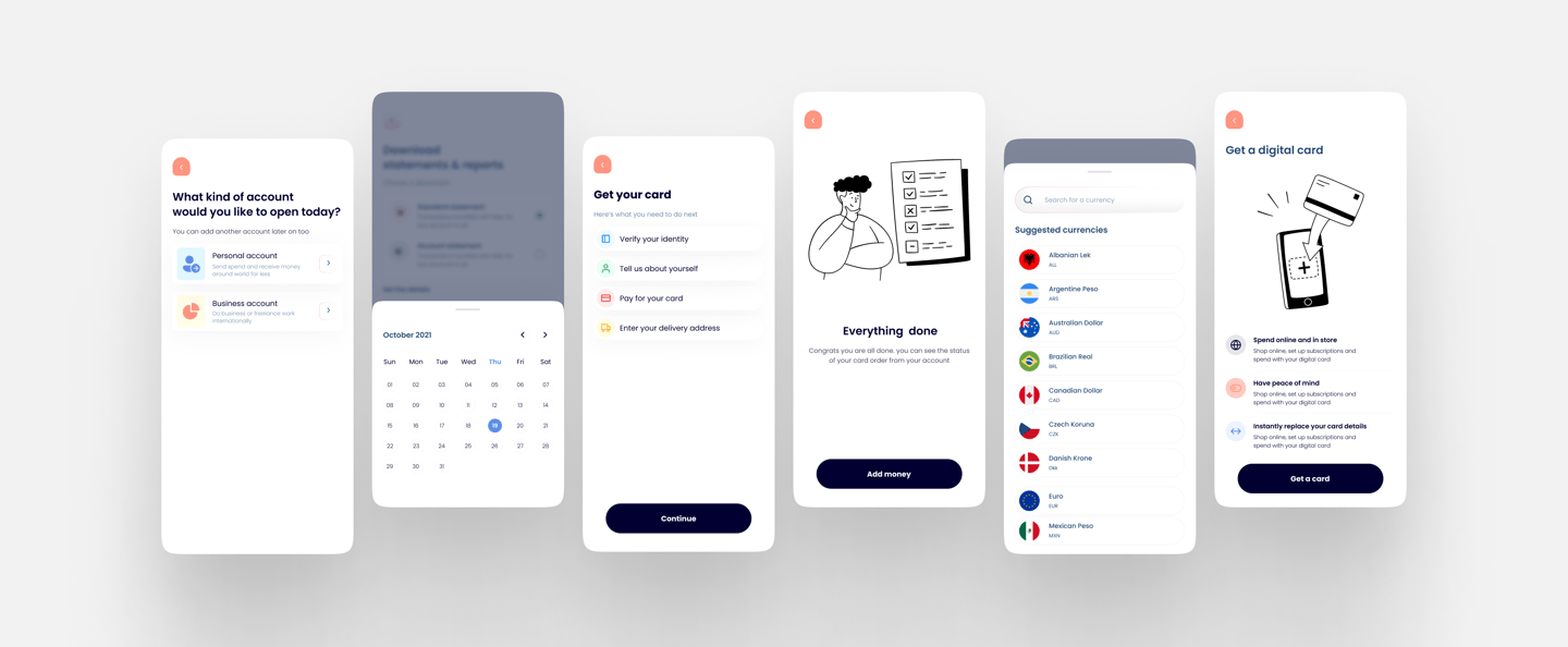
Following a comprehensive user research phase, a crucial step in this project involved conducting card sort testing. This methodology allowed us to gain valuable insights into how users intuitively categorize and organize key information within the application. The resultsof this testing proved instrumental in shaping the final design of the main screen.
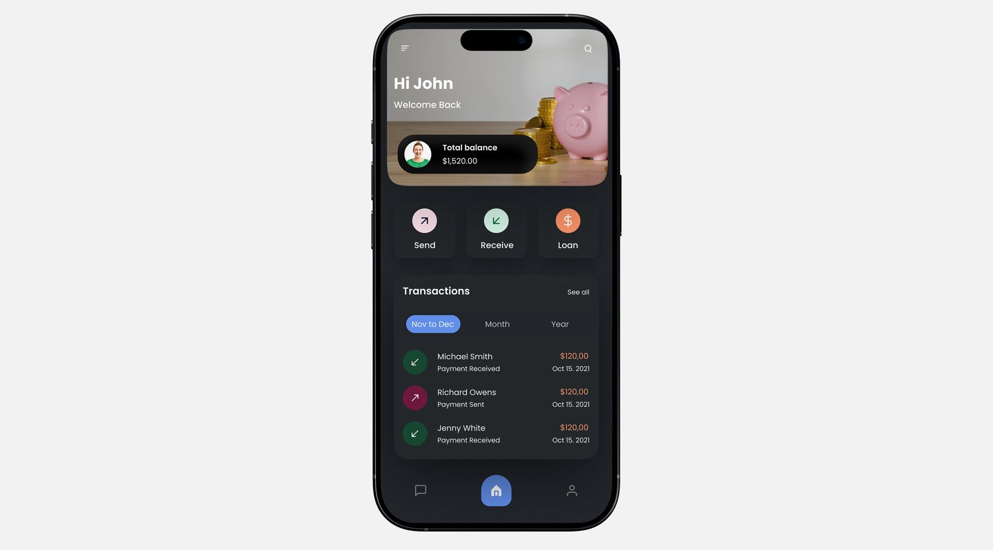
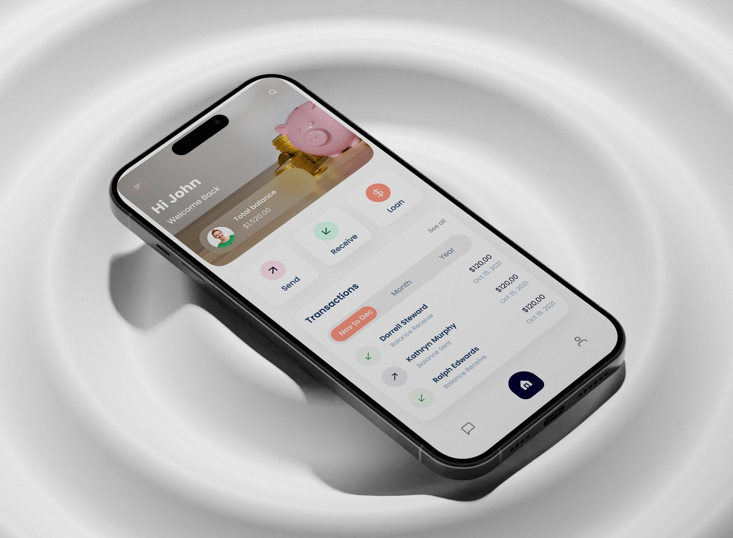
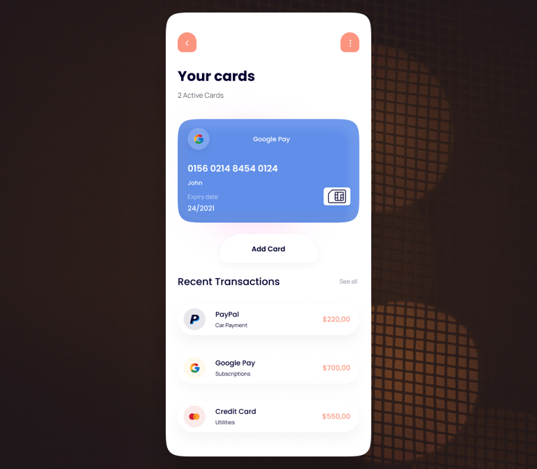
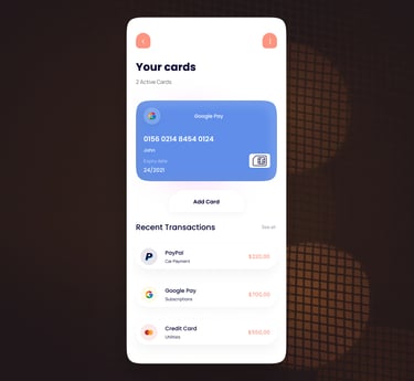
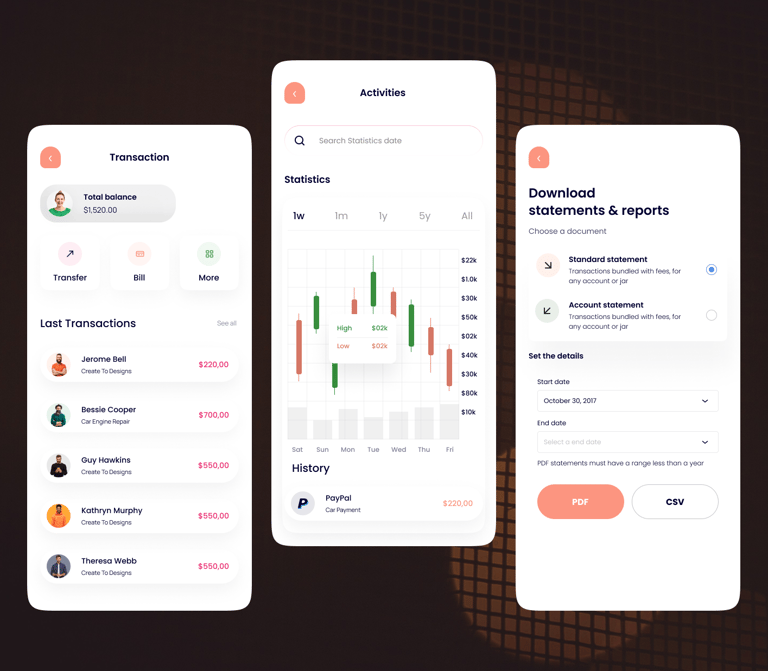
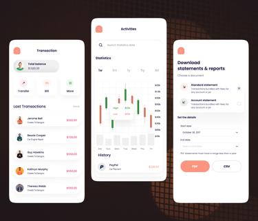
One of the key takeaways from the testing was the need for improved clarity regarding a specific feature (e.g., transactions, search). Based on this insight, I led the integration of clear and concise labels or icons directly on the main screen. This not only improved user comprehension but also allowed for quick access to this functionality without needing to navigate into separate menus.
Another area for optimization identified through testing was the information hierarchy. We observed that certain sections previously housed within a tab bar could be readily accessed and understood when presented directly on the main screen. By strategically relocating these sections, I was able to achieve a significant reduction in visual clutter. This streamlining not only enhanced the visual appeal of the app but also created a more intuitive user flow, allowing users to find the information they needed with greater ease.
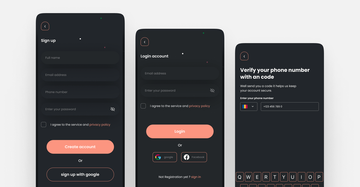
Building the User Interface
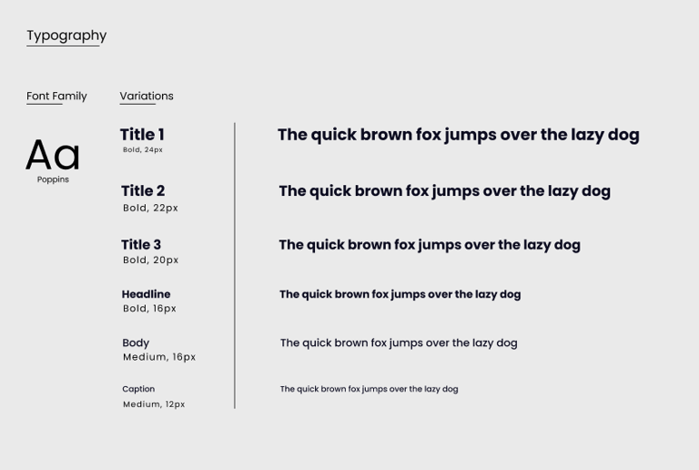
To bring clarity and approachability to the CIRCLE app experience, i focused on building a visual system rooted in accessibility, consistency, and emotional tone. Both typography and color were carefully chosen to enhance usability while reflecting the brand’s values of trust, simplicity, and financial confidence.
We selected Poppins, a geometric sans-serif typeface, for its clean, contemporary feel and strong visual presence. Its rounded shapes and consistent stroke width give the interface a sense of modernity and friendliness -perfect for a forward-thinking digital bank.
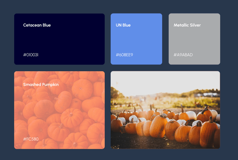
The color palette was designed to communicate professionalism and peace of mind, without feeling cold or corporate. Accessibility compliance guided every shade and contrast decision.
Dark Mode